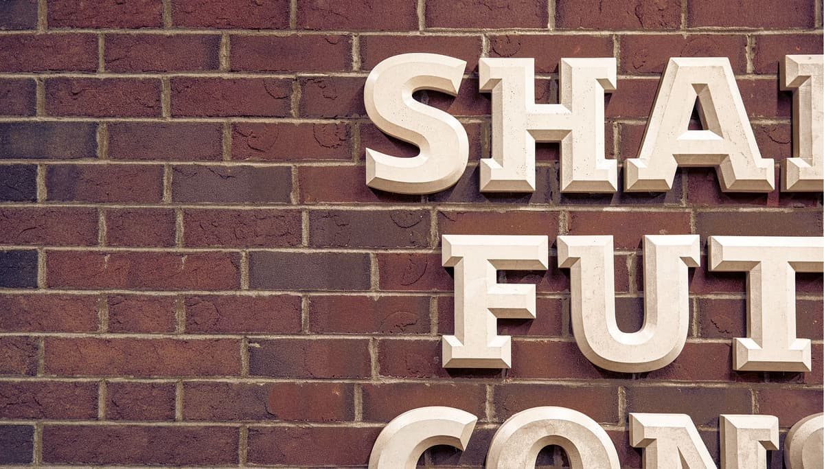
MaxTech exists to bring tactile expertise to their clients, so it’s only right that their office’s physical environment feels polished and thoughtful.
Specifically, MaxTech and its family of sub-brands provide high-quality products and services tailored to the needs of construction professionals. They deliver innovative, sustainable, and cost-effective building solutions — things that often go unseen, like insulation behind walls or underlayment beneath floors. Through our partnership on environmental design as they remodeled their corporate headquarters in Hamel, Minnesota, we sought to let their products be seen in artful ways.
The partnership was deep, unfolding over a full year — a result of starting our concepting before the bones of the remodeled office even existed. We began with floor plans and stayed adaptable as new walls appeared mid-project and delays hit at several points.
But being involved so early allowed for real collaboration, integrating ourselves into the MaxTech team. “We were there for the long haul, not just to do things fast. We were someone they could lean on,” said Joe Anderson and Creighton King, the nimble duo behind the project’s design and creative execution.
Being present as construction came together also meant we could capture lots of behind-the-scenes documentation, and that's what we're celebrating here. Some of the work looks simple on the surface, but none of it was — every piece emerged from a deeply detailed process. And in an age where so much design gets generated rather than made, we’re excited to walk through the craft behind such intricate work.
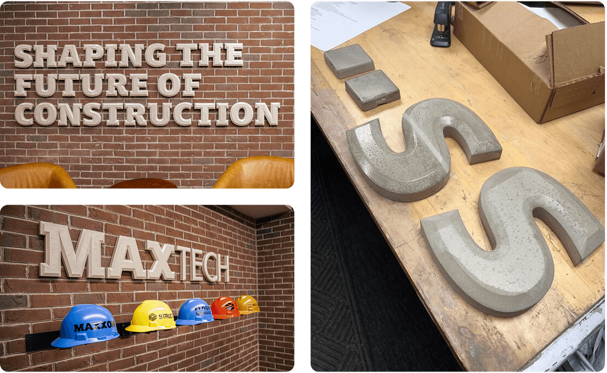
MaxTech's Lobby
Here, we needed to highlight its family of brands while still elevating MaxTech as the boss.
The molded letters heroing “MaxTech” and “Shaping the future of construction” draw from old carved marble and friezes. We pushed hard for a bevel that wasn't just the standard 45-degree angle, seeking something with more depth and history.
We also nodded to the industry through hardhat-inspired forms, and built a flexible format that can adapt as brands are added or retired over time. The brand language already existed; our job was to give it a physical home.
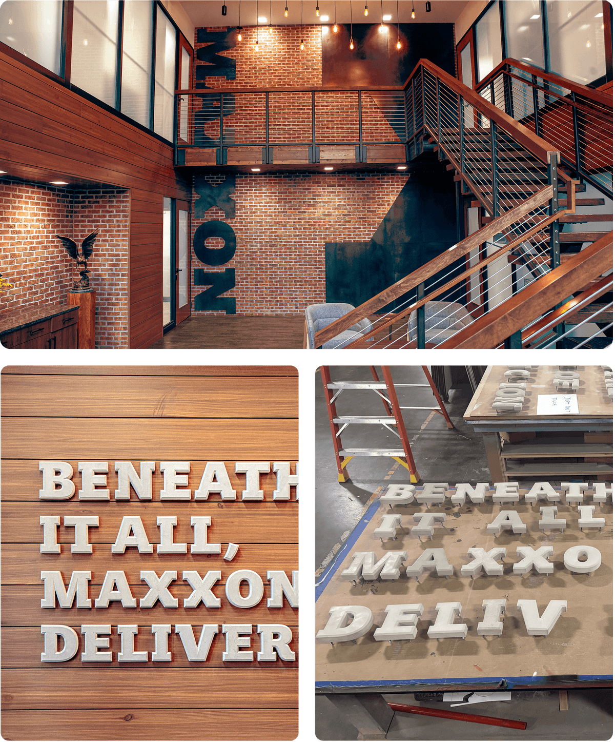
Maxxon's Lobby
Maxxon, a key growth brand under MaxTech, had its own dedicated lobby with a lot going on — display cases, branded signage, and legacy photos all competing for attention. We stripped it back, amplifying their logo across two floors and showcasing a bold brand message: “Beneath it all, Maxxon delivers.”
On a technical level, we aimed to make industrial materials look refined and monolithic. We executed the logo with a patinaed steel plate to contrast the brick cladding, embracing the raw edges and seams, and we posted it off the wall to create dimension.
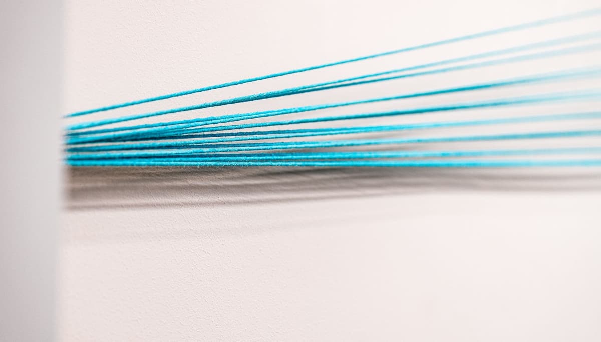
The Work Area
This space was the least defined throughout the whole project, with layouts and construction in flux for some time. But the uncertainty felt freeing, inviting us to bring wilder ideas to the table and see what resonated.
We explored a few directions: some more formulaic, like a straightforward brand timeline, some more artful, and some rooted in legacy and history.
The string installation is where we landed — an organic piece that let us creatively express the brand. This was also one of the cleanest rooms in the building, with no brick or wood. Against that restraint, even a small hit of color gave the space some life.
The Innovation Hallway
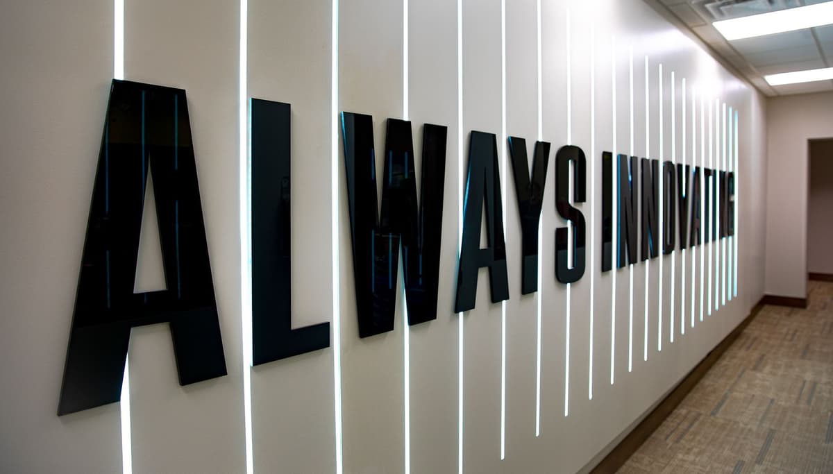
To anyone who isn’t part of the R&D team, this is just a hallway — a passthrough connecting one section of the building to the next. It runs straight through some of the most innovative parts of the company: the world’s largest floor-to-ceiling reverberation chambers, and where concrete scientists formulate custom mixes for unique applications.
Getting to sit down with the acoustic and concrete scientists was a major highlight. Their enthusiasm and thought process motivated us to transform this space, and they were eager to jump in wherever we needed them. We wanted the hallway to carry this spirit of innovation, so the lighting and messaging became actionable, motion-oriented, and put simply, cool.
The Boardroom
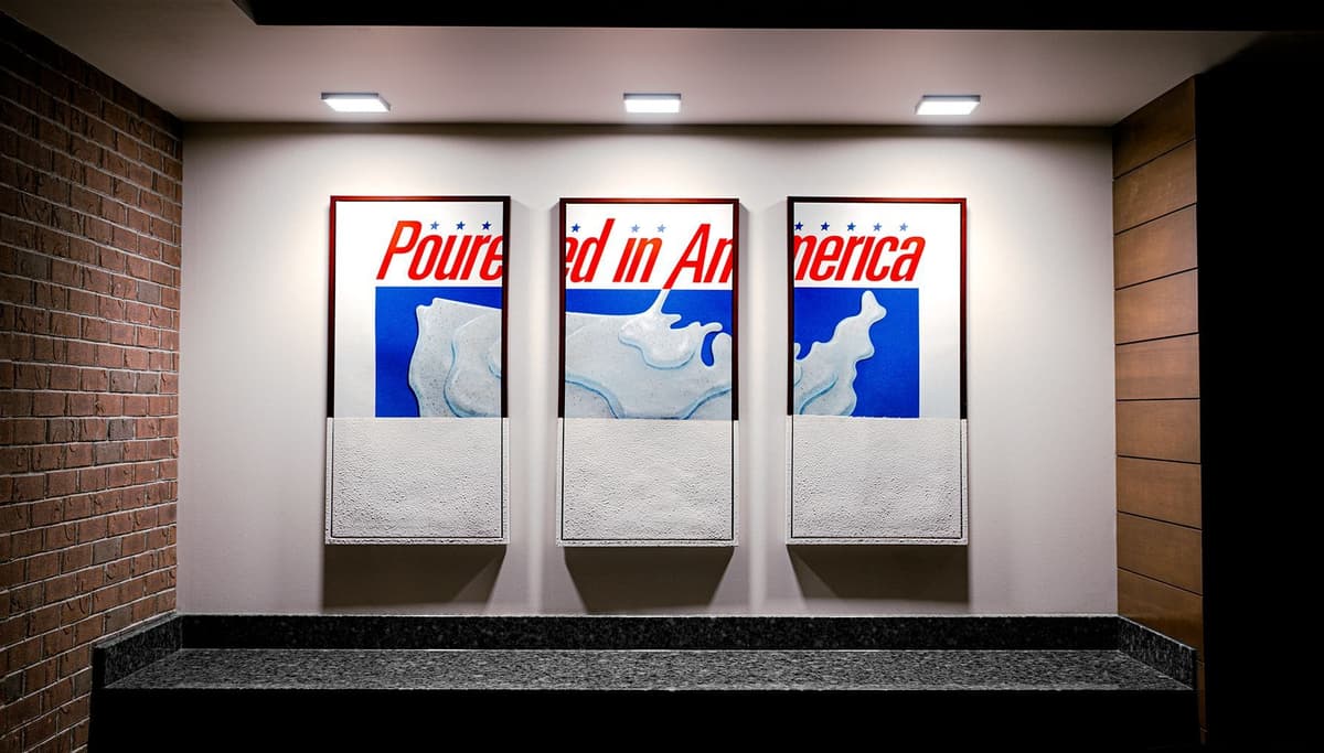
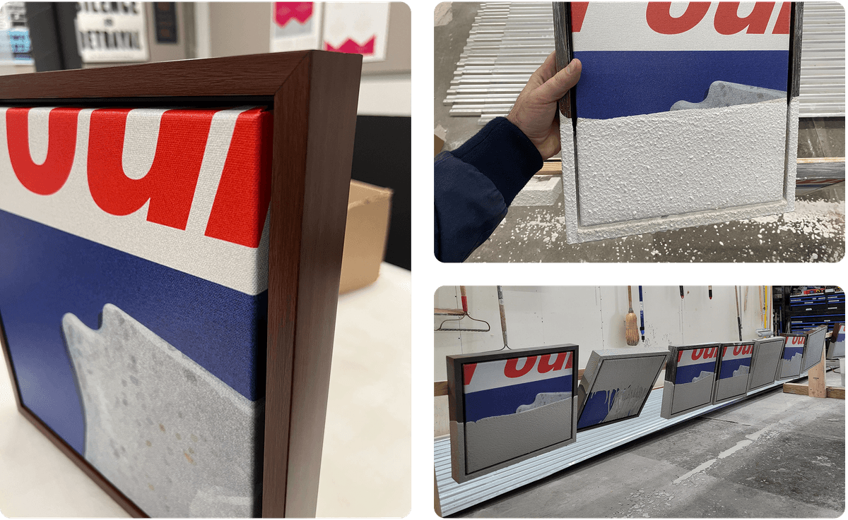
The key question here was, “What artwork do we feature?” We had access to incredible legacy photos and mementos that we wanted to amplify in this space, and we wondered if there was a significant photo that we could blow up and use as a vehicle to put their product on display. The outcome features actual dipped concrete, which required creating custom crates and experimenting with different mixes. Both the client and other departments loved the result.
Final Thoughts
At Knock, we’re committed to meeting clients where they’re at, and we’re here for long roads and fast turns alike. Embracing the whole ride with MaxTech is a huge part of what made our partnership successful and meaningful. We’re grateful to their team for their collaboration and creative openness.
If our way of working resonates, explore more of what we can do, what we’ve done before, and how to get in touch.